Consumer Cellular
Communicating cellular usage to build trust in our customer base.
Role
Product Designer
Team
1 Product Manager
3 Engineers
1 Data Analyst
1 client side Project Manager
3 client side Customer Service
Timeframe
2 months
Previous
New Experience
Consumer Cellular is a no-contract, cellular plan provider focussing on users age 50+ with close to 4 million subscribers.
They are Altsource’s largest client. Altsource has been developing their web and mobile apps for the past ten years.
Summary
Users
50 – 65 years old
Low tech savviness
Urge to be empowered by technology
Problem
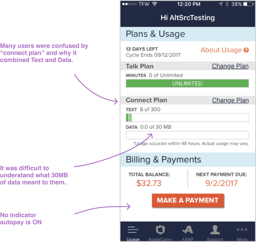
When I joined the team, they were overwhelmed with support calls from folks complaining that their bills were higher than expected.
Customers were exceeding their data usage but didn't understand what that meant. The existing screens were communicating data usage poorly.
Goals
Reduce support calls was #1 for the business and increase customer happiness.
After initial research, I uncovered more opportunities and proposed them to the business.
Research
I met with the customer service team and listened to incoming calls for two days, documenting needs, concerns and a few of the quotes you’ll see below.
After collecting that data, I put together an affinity diagram to understand relationships and identify opportunities.
Findings
Usage Screen was not Usable
The UI was cluttered, hard to read and did not pass accessibility standards. Furthermore, users didn't know what to look at, what was more important and what would keep them from going over there bill.
Reactive Process
If a customer exceeded their plan, instead of throttling or charging them per minute, they were bumped to the next plan higher, often raising their monthly payment by $10. This was confusing across the board.
The process for handling this was reactive. Customers would get a bill over their budget, they would call customer service who would apologize, explain why it happened and try to fix it.
Main sentiment: Users didn’t understand what would keep them on track to stay within their usage.
Suboptimal Explanations
It was difficult to understand the messaging. The language was a little too technical. Users expected Consumer Cellular to be better at explaining this stuff to them.
Forgetfulness and Loss of Trust
Sometimes users would call customer service because they forgot about this bill all-together.
They often felt taken advantage of or confused by what was happening behind the curtain.
Other times, they were worried, the plan bump happened again.
Core Challenges
New Product and New Framework
Reduce cognitive load for understanding usage while reusing existing frameworks on a totally new-to-me product. I needed to learn what we could leverage, rebuild and what opportunities I had for new implementation.
Communicate a Business Decision
The business wanted to keep the automatic plan bump. How could I clear up confusion surrounding it and maybe even empower our users along the way?
Balance User Needs with Business Timelines
Work across disciplines to balance business goals (let’s just solve the usage issue) against user needs (I need to understand what usage means to my life and what happens if I exceed it).
Ideation
Team Workshop
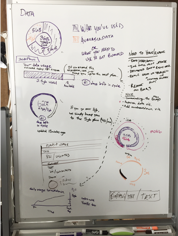
I led a team workshop with two of my peers to get some ideas going, source the ideas of other bright minds and have a little fun with the team.
I encouraged quantity over quality to start then led them into refining some favorites. After our heads down time, we pitched our favorites to each other on the white board.
Basic Agenda
Diverge (30 min)
Diverge with added feature (30 min)
Pick three favorites and diverge (20 min)
Converge on your favorite 1-3, internet now available (40 min)
Pitch your favorite 1-3 to the team (30 min)
Raising the Fidelity
After we had some of our favorites, I slid them into the current UI and scheduled another review with the team to get their thoughts. The team liked:
the 3/4 circular speedometer progress indicator
Removing unnecessary architecture if possible - Talk/Connect Plan
Helper text under each usage component
Approach
With Stakeholders
I socialized two assumptions to stakeholders:
Customers will trust us if we are better at communicating with them.
Customers will be unhappy if we prioritize sales instead of focussing on what they care about - understanding their data usage.
With Cross-Functional Teams
I validated it would be ok to remove Talk Plan and Connect Plan. Talking to marketing and the rest of the business to make sure we understood everywhere that copy was being used.
I worked with our data team to understand the data we were recognizing and how we could use it for ideas like the helper text.
I build a modular component with our engineering team to account for the 5-10 different types of potential subscriptions and the wide variety of properties types that we’d need to present.
Solutions
Make Usage Screen Usable
I nearly tripled the negative space, I brought all fonts to WCAG 2 accessibility standards and added missing data points that could help reduce calls (like showing autopay).
Removing progress indicators for unlimited services reduced the cognitive load, helping them focus on the other things...yes, even sales!
Relatable Communication
I added a sentence below the usage percentage to explain, in easy-to-understand language, the status of their plan for that billing cycle. Our database team already tracked this info but we weren’t surfacing it in the UI, so I paired with them to make this work.
At the time, every major carrier was saying “Data, Talk and Text” in their marketing campaigns. So, I reused the same language for familiarity. It made us look like we knew what we were doing and our older customers felt hip with the lingo.
Add Previous Payment Section
I heard a lot of calls come into customer support that went like this:
“The bill looks like it’s always been the same, sir.”
- Customer Support
“Well, I don’t remember what the bill was last month, or the month before.”
- Customer
I had a hypothesis that if we could show customers their payment history on the usage screen, they could easily validate for themselves, without calling customer support.
Push for Proactive
When customers went over their monthly plan, instead of throttling or charging them per minute, the business moved them to the next plan up. This was frustrating across the board so let’s give them the choice!
I added a prompt giving them the option to pick what they wanted to do. When I tested this, it showed us 3 things. The new prompt:
Cleared up communication about the plan bump
Built trust in the brand by offering “Upgrade, for this month only”
Fulfilled the persona’s core need to be empowered by technology. YES!!!
Impact
We received consistently positive feedback from customers about the new functionality and the look and feel. They felt that we were taking care of them rather than, as previously mentioned, taking advantage of them.
Less Calls and Happier Customers
Support calls have dropped steadily, and customer satisfaction was measurably higher. The call logs reported for this issue went down 28% by the time I left in September of 2017.
Onboarding
The new usage design was a big shift. I could’ve done more to help with onboarding. It was a big change for many, but after a few weeks of adjusting our data was showing time on task was reduced by almost half (for 2 key tasks in the Usage screens).
Alternatively, onboarding new customers was massively improved. We measured that after this release, new customers had 26% less calls to customer support within the first 90 days and close to 70% reduction in calls related to usage.


