Skyward - Automated Flight
Increasing user engagement by building trust in automated drone flights.
My Role
Product Designer
Team
1 PMs
3 iOS Developers
2 QA
2 SME’s
Timeline
3 Months
⚠️ Under A non-disclosure agreement
Some of the details in this case study may be vague or recreated to protect intellectual property.
Previous
New
Context
At Skyward, we help companies integrate drones into their business by making aviation management easy.
As the lead designer for our iOS and android applications, I focus on the pilot’s core workflow–which I categorize into three Jobs To Be Done buckets:
1. Planning
2. Flying (and capturing media)
3. Sharing the media with their team
User Problem
Since drones are still kind of new, pilots are constantly switching between a lot of different apps and services to complete basic tasks. This is a major pain point for pilots.
Our goal: To be the one app that does it all 🚀
Business Problem
In the data, we’re seeing heavy usage in the planning activities, heavy drop off when users begin to fly.
Why is that?
Turns out, they are switching to competitor apps for better automated flight functionality.
Our Plan
Our plan is to improve our existing automated flight feature, keep pilots flying with Skyward, and get one step closer to building their dream product.
What is an automated flight?
They are flights that automatically capture media in a consistent pattern from point to point. Drones can capture the exact same imagery on different days, which is super powerful for change detection.
Research
I got my pilots license
I earned my Part 107 Remote Pilot Certificate, so that I could fly operations alongside our customers. This also opened up the door for me to learn first hand about their workflows.
Competitive Analysis
Drone Deploy and Pix4d are industry leaders in automated flight so I took a deep dive through their solution, documented each detail and identified opportunities to do it better.
Internal Data Sourcing
Working closely with aviation experts and SME’s within the organization, I collected the existing data we had on automated flights which included requests from customers, use cases across verticals, and corporate buying checklists.
Above is a miro board showing my research.
Below, I organized key findings into something our whole team could acy on. A JTBD Journey map.
Journey Map
All this came together into Jobs To Be Done user journey maps that ended up telling the story of our highest value users and cultivating conversation with product management. This worked great for:
Noticing places in our users day where we were being effective or ineffective
Deciding where we wanted to focus our energy
Early discussions about scope
Building requirements with the development team
Coordinated alignment with cross-functional partners
Ideate
Next, I started generating ideas to improve the issues identified in research.
Lets take a closer look at one.
Issue - Flight progress is buried
In the existing feature, flight progress details were hidden in a side panel that covered important real estate during flight.
Below, see the three screens on the right side. Notice the paginated side panel with all this great data about the flight. Users want to see the flight details in the main flight view.
The arrows to the left screen are showing the most important data pilots need to see while flying – and i am suggesting a persistent module on the flight screen.
(Above)
Moving the progress details from the side panel to the main flight view.
How might I display the the flight progress in a compact, dynamic and accessible way?
The most important details to display for pilots:
Time remaining in flight
Media captured
Media remaining to be captured
Play / pause / cancel ability
Access to the menu
(Above)
Exploring components to show progress details.
Testing
Testing was not in a single phase, it was constant and at steps along the way when we needed user feedback to iterate and improve our choices.
Since I have my pilot license, I was in the field with users on a regular basis. I conducted user testing at many different steps.
I also worked closely with the development team to ensure the designs were technically feasible, scalable, and could be implemented within our timelines.
Final Solutions
Organize
In the previous design, there were five features in five different locations, making it hard for pilots to remember where things were and nearly impossible to multitask. Organizing the information architecture was the first step in making our flight mode feel trustworthy.
The new design, shown here, brings all our functionality into one spot, the Skyward Flight Menu. No matter what drone they have, the flight controls are easy to find which opened the door to multitasking. The Skyward logo also began the process of highlighting our brand, which later proved to be an asset for upselling customers on YoY sales. They remembered us and the care we put into building great tools for them.
Show Flight Progress
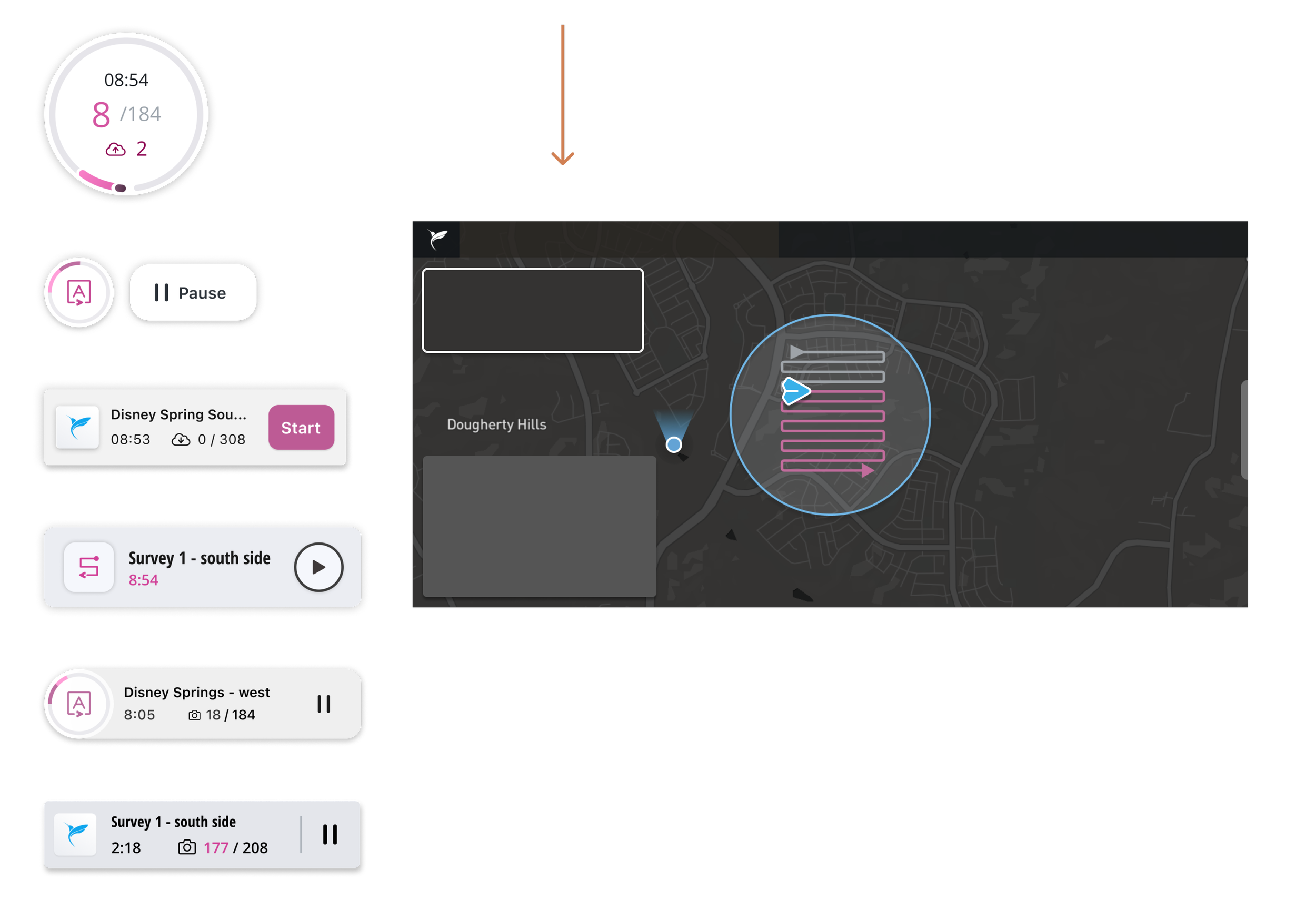
Another part of flight progress that pilots wanted in the core flight experience was time remaining, media capture and play pause functionality. The new component will deliver exactly that.
The new component gave access to the flight menu, showed time remaining in the flight and image capture status. It also had play/pause functionality and worked beautifully with existing flight screen.
Sweating the details
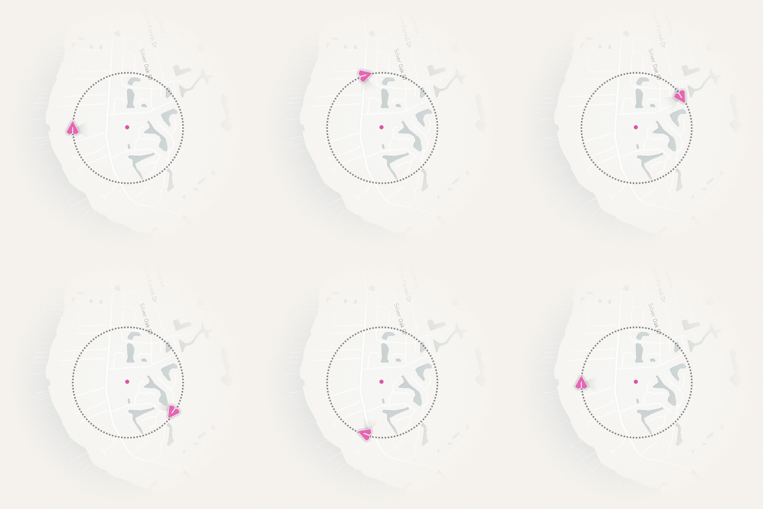
Since we had to migrate the flight path over anyway, I spent extra time finessing a new pac-man style Flight Path. It was about an extra two days but one of those extra efforts that got awesome reviews.
“This has a great feel to it and the progress is super clear on the map.”
- Bill from Brasfield and Gorrie
Sharing Important Moments
During my field research, I discovered that there are important moments before, during and after the flight where pilot’s wanted to know more from the system. Since displaying these messages was not something we had previous built, I worked an animation into the bottom of the new component to display them.
When specific events took place, we triggered it’s corresponding notification — reassuring pilots that everything was going as planned and building trust during automation.
Flexible button
The whole solution was essentially solved by implementing one flexible component that could do it all.
Reveal progress of the flight
Empower users to core functionality in a menu
Communicate events or changes
Design System
I collaborated with developers to:
Build the component at the atom level–using colors, icons and fonts within our design system.
Make it generic. We have plans to reuse this same component in the media transfer project, so we wanted flexible, text inputs and optional icons. Stuff like that.
Outcomes
It worked!
A few weeks after the release of automated flight, we are seeing retention from planning through flying. Two down, one to go!
My two favorite outcomes from this project:
We see users switching from Drone Deploy and we saw more people flying! Users were becoming more comfortable with the technology. About 60% of new customers said they were trying AF for the first time with our app because “it seems so approachable,” and 7/10 customers we interviewed said it was easier to use than Drone Deploy.
Disney win! My favorite partner to work with noticed our work which led to two more projects with Disney.
Customer Story
It was a big win for our design team internally and with our customers–receiving a bunch of story’s like this one:
"Hey everyone. I wanted to share with you a quick crisis and resolution I had today while trying to fly in Birmingham. We had a one hour authorization to fly this site, and had already spent 30 minutes trying to get DroneDeploy to work. I suggested we try [Skyward] InFlight to create a quick map and fly, AND IT WORKED! Val was able to plan 3 flights and execute them in our remaining 30 minutes without ever having used the app before.
Your product will forever be a lifesaver to me.”- Brasfield and Gorrie


